MidJourney Photorealism Guide: Prompts, Parameters & Seeds
Photorealistic AI Images with MidJourney: A Practical Text-Input Playbook for Creators
Photoreal results in MidJourney come from a repeatable method: clear subject definition, grounded camera language, controlled lighting, and disciplined parameter choices. The goal is to generate lifelike portraits, products, interiors, food, and outdoor scenes while staying consistent across a series—and avoiding the most common “AI tells” that break believability.
What “photoreal” means in AI imagery
Photorealistic AI images don’t need to be perfect; they need to feel physically plausible. The strongest results tend to share a few traits:
- Natural perspective and believable scale: hands, furniture, and everyday objects should look proportionate and usable.
- Lighting that matches the environment: shadows point the right way, highlights make sense, and bounce light feels grounded.
- Camera realism: lens behavior, depth of field, exposure, motion blur, and subtle grain feel like an actual capture.
- Material-accurate surfaces: skin texture, fabric weave, glass reflections, and metal specular highlights respect the material.
- Fewer giveaways: warped text, melted edges, asymmetrical faces, or inconsistent accessories are minimized.
A reliable text-input formula for lifelike results
Think like a photographer: define the subject, place them in a believable scene, light it coherently, then “shoot” it with camera language. A practical build order looks like this:
- Start with one specific subject line (who/what + defining traits + action).
- Add environment and context (location, time of day, weather, mood).
- Specify lighting (soft window light, overcast daylight, golden hour, studio softbox, neon spill).
- Use camera language (shot type, lens focal length, aperture feel, shutter feel for motion).
- Add material cues (porcelain skin, matte cotton, brushed aluminum, wet asphalt reflections).
- Finish with constraints (clean background, centered composition, no text, realistic proportions).
Text-input building blocks for realistic scenes
| Block | What to include | Example terms |
|---|---|---|
| Subject | Identity + defining details | middle-aged cyclist, salt-and-pepper beard, rain jacket |
| Environment | Place + time + atmosphere | city street, early morning, light drizzle |
| Lighting | Key light type + direction | overcast soft light, subtle rim light |
| Camera | Framing + lens feel + depth | 35mm, eye-level, shallow depth of field |
| Materials | Texture and reflectivity | wet pavement reflections, breathable nylon fabric |
| Constraints | What to avoid and keep consistent | no text, natural skin texture, realistic hands |
Parameters that most affect realism
After the scene description is solid, parameters determine whether the output stays grounded or drifts into stylized illustration. If you want the official definitions, MidJourney’s documentation on parameters and seeds is the best reference.
- Aspect ratio: match the final use (portrait for profile images, wider for cinematic frames, square for thumbnails).
- Stylization: keep it moderate when realism is the priority; higher stylization often introduces painterly cues.
- Quality/detail: raise it when you need fine texture (fabric, jewelry, pores); keep it lower while exploring ideas quickly.
- Chaos: low chaos for repeatable compositions; higher chaos for ideation and unexpected alternatives.
- Seed: reuse a seed to keep composition and subject features stable across a batch.
- Upscaling/refinement: finalize only after lighting and composition are already correct.
Common parameter choices for lifelike outcomes
| Goal | Suggested approach | Notes |
|---|---|---|
| Clean product photo look | Lower stylization, controlled chaos, neutral lighting | Use simple backgrounds and clear material terms (matte, glossy, brushed metal). |
| Cinematic realism | Wider aspect ratios, motivated lighting, filmic grain terms | Specify shot type (close-up, wide shot) and time of day for coherent shadows. |
| Portrait realism | Moderate detail, natural skin texture, realistic lens cues | Add constraints for hands/teeth and avoid conflicting accessories. |
| Repeatable series | Reuse seed, keep structure identical, change only 1–2 variables | Lock environment and lighting first; iterate wardrobe/props second. |
Scene recipes creators use most often
- Portraits: editorial headshots, street portraits, studio beauty, corporate profile images.
- Products: clean e-commerce shots, lifestyle product scenes, packaging mockups without readable text.
- Food: macro plating, moody restaurant lighting, daylight tabletop setups.
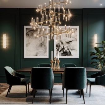
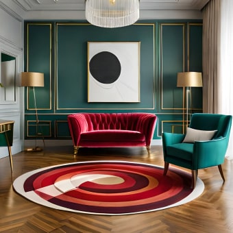
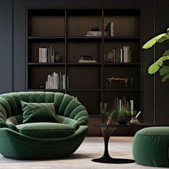
- Interiors: Scandinavian daylight rooms, cozy evening lamps, modern minimal kitchens.
- Outdoors: hiking documentary style, travel street scenes, rainy neon city nights.
- Brand-safe visuals: avoid logos, recognizable trademark designs, and readable labels.
Fixing the most common realism problems
- Faces look “plastic”: ask for natural skin texture, subtle imperfections, realistic pores, and balanced lighting rather than harsh, multi-source highlights.
- Hands and fingers distort: reduce clutter, keep hands visible and purposeful (holding one object), and avoid extreme poses or busy gestures.
- Inconsistent clothing details: simplify accessories, limit patterns, and avoid stacking too many layered garments that can mutate between variations.
- Weird reflections: specify the material (brushed vs. mirrored), reduce mixed light sources, and simplify the background so reflections read cleanly.
- Text artifacts on signage/packaging: request blank labels, no typography, and clean surfaces; avoid tiny labels that invite unreadable lettering.
- Perspective issues in interiors: specify camera height and lens feel, keep the furniture count low at first, and only add props after the room geometry looks right.
A repeatable workflow for consistent batches
Digital downloads for creators: ready-to-use text templates
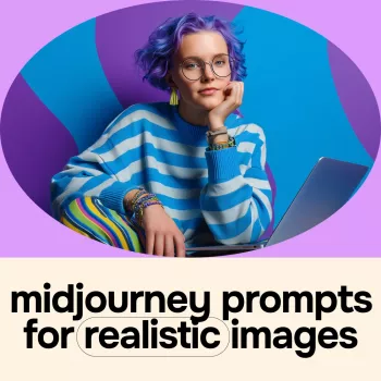
- MidJourney Prompts for Realistic Images – Pro Guide to midjourney prompts for realistic images, Photorealistic AI Art, Digital Download for Creators
- Train Smarter and Make Your Gear Last – Sports Gear Care Guide, Digital Download eBook & Checklist for Athletes
FAQ
How can consistency be maintained across a series of images?
Reuse a seed, keep the structure of the text input identical, lock the environment and lighting first, then change only one variable at a time (like wardrobe color or a single prop). This prevents subtle drift in facial features, framing, and scene geometry.
Why do faces sometimes look artificial even when the scene is detailed?
Faces can drift into over-smoothing when stylization or beauty-like lighting overwhelms texture cues. Asking for natural skin texture, subtle imperfections, and simpler, motivated lighting usually restores a more believable look.
What should be done to avoid distorted hands and unreadable text?
Keep compositions simple and make hands purposeful (one clear action, one object), and avoid tiny labels or signage. Request blank labels, no lettering, and clean surfaces so the image doesn’t attempt to “invent” typography.


Leave a comment