AI Selfie Color Analysis: Find Your Best Shades Fast
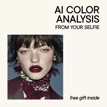
AI Color Analysis From Your Selfie: A Smarter Way to Find Your Best Shades
Choosing flattering colors gets easier when undertone, contrast, and brightness are measured instead of guessed. A selfie-based AI color analysis can help narrow down a personal palette and translate it into practical choices for clothing, hair, makeup, and accessories—especially when paired with a step-by-step guide that explains what to do with the results. Think of it as a fast way to identify which colors echo your natural coloring (and which ones tend to wash you out) before you invest in a new lipstick, jacket, or hair gloss.
What selfie-based color analysis measures
Most AI color tools look for a handful of repeatable “signals” in your face and neck area. While each system has its own model, the useful outputs tend to cluster around the same fundamentals.
- Undertone direction: warm, cool, or neutral tendencies inferred from skin hue patterns.
- Chroma (clarity): whether clearer/saturated colors or softer/muted colors tend to harmonize.
- Value (lightness): preference for lighter vs deeper shades based on facial features and skin depth.
- Contrast level: how much light-dark separation typically looks balanced (low, medium, high).
- Why this matters: these signals guide which colors echo natural coloring instead of overpowering it.
Core color signals and how they show up in wardrobe choices
| Signal | Often looks best with | Often looks harder to wear |
|---|---|---|
| Warm-leaning undertone | ivory, camel, warm greens, coral, gold metals | icy pastels, blue-based pinks, stark cool grays |
| Cool-leaning undertone | true white, cool blues, berry, emerald, silver metals | yellowed beiges, orange-heavy reds, warm browns |
| Higher chroma (clear) | clean brights, jewel tones, crisp contrasts | dusty/gray-washed shades that feel dull |
| Lower chroma (soft) | muted rose, sage, taupe, smoky blues | neon brights or very vivid primaries |
| High contrast | bold pairings, black/white, defined prints | head-to-toe midtones with little definition |
| Low contrast | tonal outfits, heathered neutrals, gentle transitions | harsh black/white or overly graphic patterns |
How to take a selfie that gives reliable results
Selfie-based analysis is only as stable as the lighting and color casts in the photo. A few small setup choices can make the difference between “spot on” and “why does this look wrong?”
- Lighting: face a window with indirect daylight; avoid warm indoor bulbs and colored LEDs.
- Background: use a plain neutral wall; avoid bright clothing or backdrops reflecting color onto skin.
- Camera settings: disable beauty filters, smoothing, and “portrait” color effects when possible.
- Pose and framing: straight-on, eyes open, hair pulled back; include face and neck for better sampling.
- Makeup and tanning: remove heavy makeup, bronzer, and self-tan; these can skew undertone and value.
- Consistency: take 2–3 selfies in similar lighting to compare and confirm stable results.
If you tend to have redness, acne marks, freckles, or hyperpigmentation, don’t panic if the first read looks “off.” Skin appearance can shift with irritation and skincare routines; that’s why repeating photos matters. For foundational context on tone, redness, and pigmentation factors, see the American Academy of Dermatology Association.
Turning AI results into a wearable palette
The most helpful reports don’t stop at swatches—they tell you what to buy, how to combine items, and how to avoid the “closet full of almost-right.” Use your results to build a compact palette that works across seasons and shopping trips.
- Start with neutrals: pick 3–5 base neutrals that match undertone and contrast (e.g., ivory vs optic white; cocoa vs charcoal).
- Add face-framing colors: choose 6–10 shades for tops, scarves, and outerwear closest to the face.
- Choose accent colors: select 3–6 bolder shades for bags, shoes, jewelry, and prints.
- Match metals and stones: use undertone guidance to narrow gold/silver/rose gold and gemstone families.
- Create outfit formulas: build repeatable combos (neutral + face-framing top + accent accessory) to reduce decision fatigue.
When a palette feels “too strict,” use placement. A tricky color can still work as a skirt, shoe, or bag, while your strongest shades sit near the face in tops, earrings, and scarves.
Common pitfalls and how to avoid them
- Over-trusting a single selfie: different lighting can shift perceived warmth/coolness—look for patterns across photos.
- Confusing “favorite colors” with “best colors”: favorites can still be worn, but placement matters (away from the face, or balanced with makeup/accessories).
- Ignoring contrast: undertone alone is not enough; contrast drives how bold a print or dark a jacket should be.
- Assuming one fixed season forever: hair color changes, tanning, and aging can nudge the palette; reassess occasionally.
- Forgetting fabric and finish: shiny satin reflects more light than matte knit; the same color can behave differently.
Color is also measurable in standardized ways—useful when you’re comparing swatches across devices. For deeper technical background on color measurement concepts, visit NIST or the International Commission on Illumination (CIE).
How to Choose a selfie-based AI color analysis guide
Not every guide turns results into real-life decisions. A strong personal color ebook or guide should help you move from “analysis” to “outfit.” Look for these features:
Practical mini-checks to confirm your best colors
FAQ
Can an AI color analysis from a selfie really find undertone accurately?
It can be directionally accurate when the selfie is taken in neutral daylight with no filters and minimal makeup, then confirmed across multiple photos. Treat the result as a starting point and verify it with real-life fabric and metal comparisons.
What should be avoided when taking a selfie for color analysis?
Avoid warm indoor lighting, heavy makeup or self-tan, beauty filters, colored backgrounds, and bright tops that reflect color onto your face. These can shift undertone, value, and contrast readings.
How often should personal color analysis be updated?
Re-check after major hair changes, significant tanning, or every few years. Undertone and natural contrast often stay fairly consistent, but styling variables can change how your best palette looks in practice.









Leave a comment